

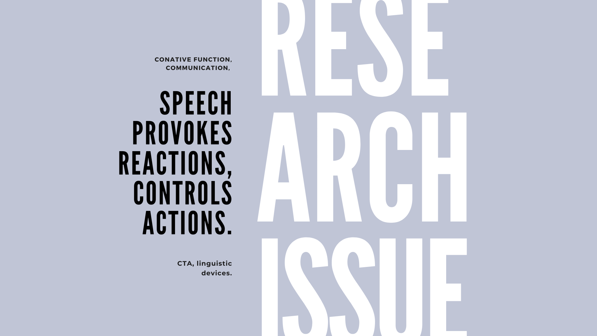
Among the six functions of human speech, there is one that focuses on the receiver: the conative function, whose goal in communication is to provoke a response in the receiver. Consequently, every act of communication elicits a reaction in the recipient, although controlling that reaction to motivate a particular action is another matter, since various factors may condition that response.
For example, we might command someone to close the door, which will undoubtedly elicit various actions, ranging from closing it immediately, to closing it later, to not closing it at all; all depending on the attitude of the sender and the will of the receiver. This raises the question of whether there is any way for the receiver to respond in a manner dictated by the sender.
In fact, many languages have linguistic devices directed toward this end, expressing orders, commands, requests, prayers, or desires, expressed through imperative, vocative, and expressive formulas [2]. These formulas, along with pragmatic aspects such as the context and the nature of the interlocutor, penetrate the consciousness of the recipients and guide them to perform a pre-determined action.
This is exactly what is intended by the statement we use to guide the steps of a user in their journey through the funnel [3]: the Call to Action (CTA), whose conative nature aims to provoke a reaction to perform a specific action.
The call to action as a linguistic element
From the previous considerations, it can be deduced that the call to action is not just a button, but a complex element whose conative nature connects it to an essential component of communication: the receiver. For this reason, it must resort to very specific linguistic and semiotic aspects that allow it to achieve its goal: to provoke a reaction in the receiver that leads to the achievement of a given action.
As a result, it is not surprising that authors such as Mastropierro[4] claim that the CTA is a statement in which the user is told what to do. Other authors also believe that the CTA "consists of the use of words or phrases that can be integrated into sales and advertising messages, prompting the user to take an immediate action."[5]
For us, the CTA is primarily a linguistic element of a conative character, manifested in imperative, vocative, and expressive formulas that take the form of orders, commands, requests, pleas, or desires.
Our previous studies suggest that there is a discursive difference between the various spirals of the funnel, since the target of each spiral changes and the CTA is one of the elements most sensitive to this fact. In this way, these formulas are adapted to the context of each spiral of the marketing funnel and the type of recipient.
For example, the CTA of the acquisition funnel is expressed by formulas such as "Reserve your spot", "Read more", or "Click here to sign up", which mitigate the imperative aspect in favor of the semantic prompt. Similarly, the nutrition funnel CTA mitigates the imperative with friendly formulas such as, "Try for free for 1 month", "Start the free trial", or "Add 7 days free trial", all of which revolve around the semantic property of gratification. The CTA of the conversion funnel reinforces the categorical imperative with formulas like "Upgrade to Premium", "Get Jira Cloud for mobile" [6], whose meaning revolves around the urgency semantic.
As can be seen, these formulas, although imperative, are weakened at the top and in the middle of the funnel by the semantic features invitation and gratification, while at the bottom the imperative is emphasized by the semantic feature urgency. In this way, each spiral of the funnel revolves around a semantic field that determines the discursive theme developed in each spiral of the funnel.
The CTA as a design element
Despite the great importance of the linguistic element, any element that elicits an immediate response can be considered a CTA [7]: a link or an image, for example. However, it is more common for the CTA statement to be framed by a graphical component, which we call a button and whose purpose is to draw attention to the statement [8]. In this sense, we are dealing with a discursive element that has been transformed into a universal visual representation that can be understood by a wide variety of people, cultures, and times [9].
This is due to the fact that, as Ware affirms, "visualizations are an increasingly important component of cognitive systems"[10] because through them we can access, almost unconsciously and in fractions of seconds, the understanding of complex elements, through preattentive processing [11] essential to visual discrimination.
For this reason, the button is an efficient means of transforming a discursive element into something that users can perceive as a mechanism through which they can express their decision-making, and therefore it is important to pay attention to balance in the design, as it depends largely on rebound or implementation.
Since the button is an element associated with a process of pre-attention, the design must take into account visual pre-attention[12] properties such as color, shape, movement or spatial position, since the knowledge absorbed through this path is assimilated without conscious effort, facilitating comprehension.
The visual properties of attention: color, shape, movement,and position
Color
We have the sensation of seeing colors because we perceive the light waves reflected from objects, which take on different lengths depending on the hue, intensity, and clarity of each color. These properties, including hue, saturation, and luminosity are very useful for visually distinguishing elements in an environment because they allow them to be located quickly and with minimal effort, as seen in numerical Tables 1 and 2, whose contrast illustrates the way in which color isolates an element from its surroundings and allows for quick identification.
1.

2.

Identifying the number 9 in Table 1 requires an effort of conscience that means more time, a resource that many users are not willing to invest, especially in an environment as saturated as the Internet. In contrast, Table 2 does not require any effort, since the color makes it easier to find the repetitions of the number 9 and minimizes the conscious effort. This fact undoubtedly favors navigation in a saturated environment, since the elements are offered for viewing, avoiding excessive efforts that make the user interrupt the navigation.
Shape
It is not easy to define what a shape is, because behind its concept, there is a psychological framework that plays with perception, since the mind creates shapes where there are none and, as if that were not enough, gives them a meaning. However, if we start from geometry, a shape is primarily a two-dimensional surface that lies within a recognizable boundary and can form circles, squares, triangles or rectangles, depending on the configuration of its angles. Nevertheless, there are also the organic shapes of nature as well as abstract shapes that are more difficult to recognize.
Regardless of perspective, however, a shape is a positive space with a set of attributes that can be manipulated to draw or detract attention. To emphasize the importance of an element, one can enlarge its shape, or conversely, to diminish its importance, one can make it smaller. By this reasoning, size is one of these attributes, as are orientation and width, from a wide range of properties as shown in the figure below.
![Preattentive visualize attributes. Taken from Wexler, S. et al. (2017).[13]](https://uploads-ssl.webflow.com/58b618b3c9f75bcd08f89598/632244f3ac88b671bf464854_image%203.png)
Movement
For decades, some experiments have shown that we react faster to the stimulus of a moving object [14]. This fact makes this action an ideal precautionary component. For this reason, movement is an essential element in design.
However, it should be noted that this discipline is more of an illusion, where the position changes over time, using various techniques such as blinking and changing direction to make the eyes move on the screen, rather than design as such. From this perspective, it is a dynamic effect created by kinesthetics, through the change of position and the rhythm created by the repetition of lines, shapes and colors. However, this conception has evolved, and now it is the elements that move through cinematographic techniques such as animation. This new conception of design has given rise to a design current called motion design, whose specialty is setting graphics, infographics, and even typography in motion, making movement a very effective means of attracting and directing attention.
Position
A shape is related to the plane that delimits it, and it is expressed by a coordinate axis that determines this relationship according to the plane it occupies in two-dimensional space, on the Y or vertical (top, bottom, and center) and the horizontal X (left, right, and center).
Now, in three-dimensional space, a Z axis is added to the Y and X axes, which expresses another dimension: depth, whose features are expressed through the dimensions of width, height and length. The sensation produced by these combined dimensions becomes a preattentive stimulus that is processed in fractions of seconds in the brain as a feature that makes an element stand out in its environment.
The balance in the design of the landing page CTA button
In the previous lines, we defined the CTA as a discursive element that is transformed into a universal visual representation that is given the name of a button. The latter is a visual element of great importance, since it represents the goal of the conversion process, so it is a priority to focus attention on it. For this reason, the balance of its design is so important, since the bounce or conversion largely depends on it.
Based on this maxim, we have now set out to determine which elements are responsible for the balance in the design of the CTA button on the landing page and which are the visual characteristics before attention that have the greatest weight in the design of this element.
Study Approach
Metrics are undoubtedly one of the best ways to determine performance and effectiveness through experimentation. However, observing and analyzing patterns or examples that have already been structured and tested by experts is another alternative that allows us to determine the essential elements of a fast user interface.
In this case, we opted for this last method to determine the elements responsible for the balance in the design of the landing page CTA button, in addition to the visual characteristics that are most important in the process.
To this end, we compiled a corpus of 50 of the best landing page examples according to Unbounce and Hubspot, representing a wide range of industries from the SaaS and e-commerce sectors. In this corpus, we analyzed the visual characteristics of the color, shape, movement, and position of the CTA button on each of these pages to later determine their impact on the page.
The visual properties of the CTA button on landing pages
The color of the CTA button
The CTA button on the landing page offers only a dozen options when it comes to color. In this reduced area, the primary colors red, blue and yellow generally have very low frequencies, as do colors like white and black, whose frequencies do not exceed 6% each. However, secondary colors such as green with 22%, orange with 12%, and red-orange with 10% have the highest frequencies. Other tertiary color combinations such as green-yellow, green-blue, red-violet, and blue-violet have a frequency that does not exceed 6%.

Looking at this data, we can conclude that mainly green together with orange and red-orange are the predominant colors for the CTA button on landing pages, as these three colors together account for more than 40% of the cases.


The shape of the CTA button
As for the shape of the CTA button, a trend can be observed in its characteristics. First of all, the CTA button is represented in two ways: by a rectangular two-dimensional figure, which is common in 70% of cases, and by an ordinary elongated two-dimensional shape in the remaining 30%.


Another format attribute that shows a trend is the size of the CTA button, with 64% of the cases being typical of the middle range, while the remaining 36% show the CTA button at a small size. These size differences are indicated by the height and the width of the button, but mainly by the latter attribute, as it most clearly shows the size difference between a medium and a small CTA button, even though it is rectangular in both cases.


On the other hand, the data suggest a bias towards luminosity over opacity, where a CTA button with a higher luminosity level, up to 54%, is more common. Nevertheless, 46% of the sample prefers the use of opaque colors for the CTA button.


Another attribute of the form that must be mentioned is the orientation, which is horizontal in 100% of the cases, as can be seen in the previous figures. This may seem like a superfluous fact, but it is the common factor that 100% of the cases in the sample have, since in no case did we find a CTA button whose orientation is oblique or vertical.
The CTA button movement
Now, as for the visual feature of movement, it was found that 78% of the sample use blinking (fast color change) as an option to give a sense of movement when the mouse cursor is placed on the CTA button. Another option to give the button a sense of movement is to move the background color rapidly and progressively in one direction. However, the frequency of occurrence of this option is only 6%. It was also found that a small percentage of pages refrain from using motion elements, but as in the previous case, the percentage is only 8%.

The position of the CTA button on the landing page
This is another feature that indicates a trend because when we analyze their variants, we find that 96% of the cases position the CTA button vertically in the top block of the page, although it should be noted that only 26% of the cases are limited to the use of a single button and its placement in this single position. Most often, the CTA button occupies more than one vertical position on the page. In this case, the CTA button is most often placed in the top block, middle block, and bottom block of the page, which is the situation in 54% of the cases. A third option positions the CTA button exclusively in the top and bottom blocks at least 20% of the time, giving us 3 possible vertical positioning schemes.
1.

2.

3.
%201.jpg)
If we now compare the vertical positioning variants of the different blocks with the horizontal positioning variants (left, center, right), we can also observe a trend indicating that the CTA button in the top block of the page tends to be positioned on the left in 44% of the cases. For the second positioning option in the top block, the CTA button tends to be positioned on the right in 32% of the cases. Only 24% tend to place the CTA button in the middle, which is the least frequent position in the top block of the page.

However, in the middle block of the page, horizontal positioning is distributed more evenly between right, center, and left; in fact, none of these positions exceeds 20% frequency, which suggests that, in the middle block, the CTA button can occupy any of these positions indistinctly.

Now, in the bottom block, the trend shows something completely different than in the top and middle blocks, as 56% of the cases tend to position the CTA button in the middle of the bottom block, only 16% position it on the left and 14% on the right.

Conclusions
Since it is primarily a statement, the CTA is a linguistic element of conative character, expressed through imperative formulas such as mandates, commands, requests, or appeals. This fact is evident in each of the spirals of the marketing funnel, whose objectives create a kind of discourse that is evident in the CTA of the landing pages. However, this statement is usually framed by a graphic component that we call a button, whose purpose is to draw attention to this statement by framing and defining it. In this sense, we are dealing with a discursive element that is transformed into a very efficient, universal visual representation so that the user can perform a specific action at a specific time. This is why the balance in the design of the CTA button on landing pages is so important, since the bounce or conversion depends on it to a great extent.
Since the CTA button is a visual element, the knowledge conveyed through it must be absorbed without conscious effort to facilitate comprehension through pre-attentive visual characteristics such as color, shape, movement or spatial position. It is logical, then, that an element whose design has such an effect is not designed arbitrarily. Consequently, it is of primary importance to know which of these properties play a greater role in the design of the CTA button on landing pages.
The analysis of the visual characteristics of the CTA button on a set of 50 landing pages has allowed us to observe the predominance of some of the attributes that make up these characteristics, the results of which we list below.
- In terms of the visual property of color, it was found that the CTA button is limited to 12 choices. Of these, the predominant colors are green, orange, and red-orange. The other combinations such as green-yellow, green-blue, red-purple and blue-purple are very rarely encountered.
- The size of the CTA button shape is generally medium, although of course it is also small, but less frequent. This variation in size is primarily due to width, as it is the feature that most clearly indicates the difference in size between a medium and small CTA button.
- Another feature of the form that stands out is luminosity versus opacity, where a CTA button with a higher degree of luminosity is more common, but this does not mean that opacity is not used, just less frequently.
- Orientation is an attribute of the shape that determines the CTA button, as in all cases it is horizontal, in no case did we find a CTA button whose orientation is oblique or vertical.
- The movement is a visual attribute, generally determined by blinking. However, background color scrolling was identified as another motion attribute, but this option rarely occurs.
- In terms of position, it can be noted that in almost all cases the CTA button is positioned vertically in the top block of the page, although it should be noted that only 26% use this last variant as the only option.
- Most often, the CTA button occupies more than one vertical position: in the top block, in the middle block and in the bottom block of the page.
- There is a third scheme where the CTA button is positioned in the top and bottom block, however, this is the least frequent variant where we have 3 possible vertical positioning schemes.
- When contrasting the vertical position variants with the horizontal ones, it can be seen that, when it is in the upper block of the page, the CTA button is located predominantly on the left; your second positioning option is on the right and the third is in the center, this being the least frequent position at the top of the page.
- In the middle block of the page, the horizontal positioning of the CTA button is more evenly distributed between right, center and left, which may indicate that the CTA button can occupy any of these positions in the middle block.
- In the bottom block, the trend indicates something completely different than in the top and middle blocks, because here the CTA button is usually in the middle, with only a handful of pages positioning it on the left to right.
References
[1]Bauer, E. (2020). Get More Conversions with Lessons from 13 Irresistible Call to Action Examples.Ubounce. Recovered https://unbounce.com/conversion-rate-optimization/call-to-action-examples/.
[2]Jackobson, R. (1984). Essais de linguistique générale.
[3]Mastropierro, C.(2020). Sell Like Hell - The Copywriter's Nifty Handbook.
[4]Mastropierro, C.(2020)
[5]Singh, Ch., Abraham, A., Pandey, A. (2018). Inbound Marketing. BPB Publications. India.
[6]Rojas, N. (2021). E-mail marketing: nature, structure, and discourse. Recovered https://www.quo.agency/insights/e-mail-marketing-nature-structure-and-discourse.
[7]Singh, Ch., Abraham, A., Pandey, A. (2018).
[8]Aagaard, M. (2013). How To Design Call to Action Buttons That Convert. Unbounce. Recovered https://unbounce.com/conversion-rate-optimization/design-call-to-action-buttons/.
[9]Ware, Colin.(2013). Information Visualization Perception for Design. Elsevier.
[10]Ware, Colin.(2013).
[11]American Psychological Association. APA Dictionary of Psychology. Recuperado de: https://dictionary.apa.org/preattentive-processing.
[12]Ware, C. (2013).
[13]Wexler, S., Shaffer J., Cotgreave A. (2017). The Big Book of DashBoarDs: Visualizing Your Data Using Real-World Business Scenarios. New Jersey, Wiley.
[14]Ware, C. (2013).